Case Study:
Design Strategy

Auditors use two platforms (Platform A and Platform B) for data and analysis, along with several supporting interfaces. This setup has proven challenging for users to navigate and do their tasks.
The decision
To address the learning curve, Platform B adopted Platform A’s style guide and design system. This approach enhances user familiarity and reduces cognitive load, despite the platforms’ distinct functionalities. This business case will focus on the analysis module.
Implement Platform A’s style guide and enhance user experience in the Analysis Module of Platform B
My Role:
UX/UI Designer
Team (31):
3 UX/UI Designer, 3 UI Designers,
15 Developers, 1 CTO, 5 BSAs,
4 Product Owners, and other
Stakeholders
Team (31): 3 UX/UI Designer, 3 UI Designers,
15 Developers, 1 CTO, 5 BSAs,
4 Product Owners, and other
Stakeholders
Duration:
4 Months
3 Years in the account
Company:
Deloitte USA
Year:
2024
Discovery
(Managed by POs)
User Testing and
Feedback Collection
Analysis
Design Strategy
(4 months)
Requirement
Definition
High Fidelity
Mockups
Design Exploration
Design System
Design Refinement
Documentation
Development
(Iteration timing)
Scrum Adaption
Backlog Priorities
Sprints
Test Environment
Staging Environment
With the redesign of Platform B’s design system, we aim to enhance user experience.
Managed by the product owners team, involves systematically evaluating software through user interactions and gathering their feedback. This process ensures that the product meets user needs and expectations by analyzing collected data to make informed improvements before final release.
Outputs: User Stories for designers (3-5 per week) or PBIs for the development team.

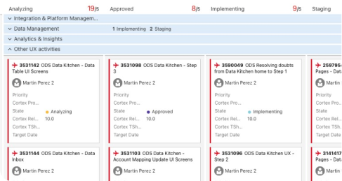
We developed new experiences based on user stories in our dashboard tasks, after first holding a meeting with the involved team.

-Product Owners (2-3): Deliver the required tasks and set priorities.
-UX/UI Design Team (2-3): Open discussions with POs and BSAs to make the best approaches for the new designs.
-Business Systems Analysts (2-3): Consider design proposals’ integration with other modules and business needs.
-Meetings Frequency: 3 Times per week.

After the meeting, the design team starts
working on the requirements.
We make design proposals in high fidelity since we have Platform A design
system. Design exploration was implemented when doing the screens.
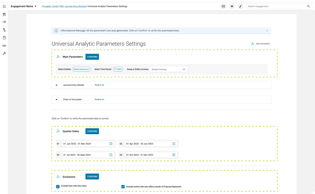
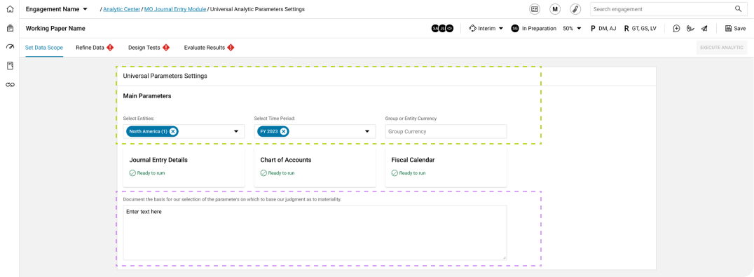
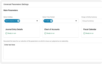
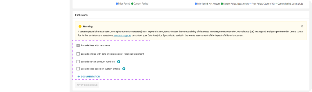
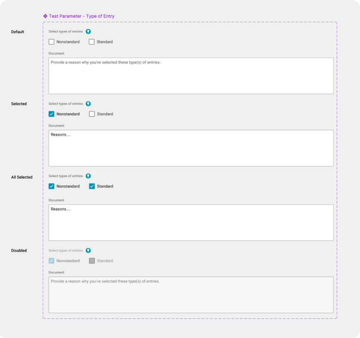
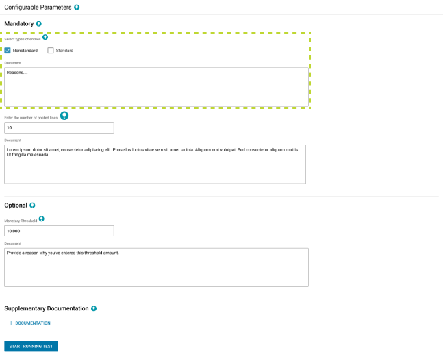
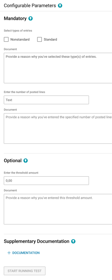
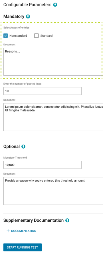
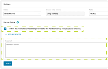
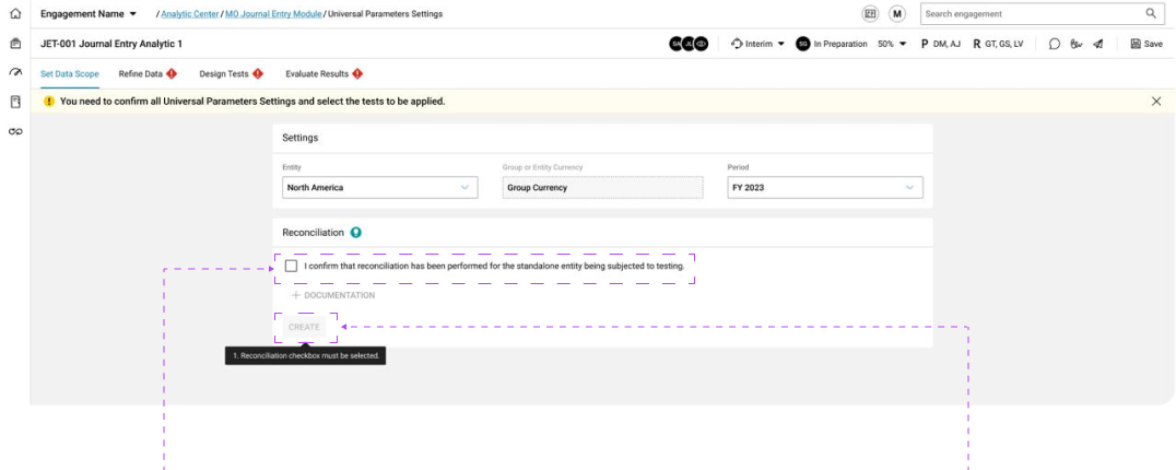
This screen has three sections: main parameters, quarter dates, and exclusions. Main parameters are essential to start, while quarter dates and exclusions can be set later. After discussions, the main parameters will stay, and the others will move to another screen.
From this point, we decided to explore 3 possible designs.
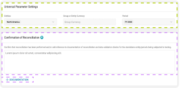
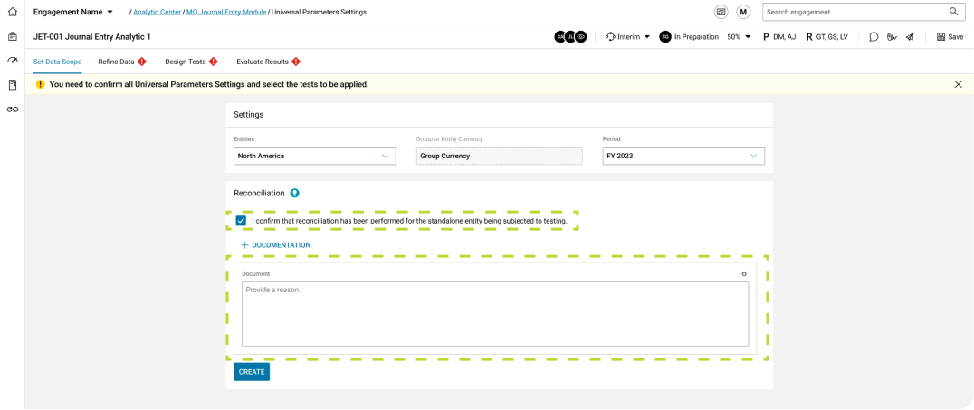
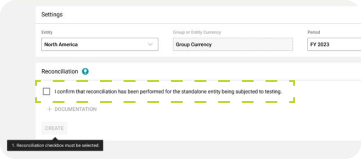
Universal Analytic Parameters Settings
The main parameters remain on the settings screen.
Document Reconciliation was added (explain auditor actions).
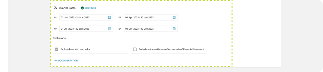
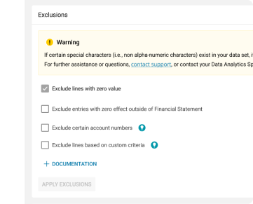
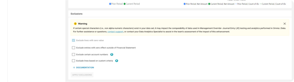
Exclusions
Quarters and Exclusions were moved to the Refine Data screen.
Universal Analytic Parameters Settings
The main parameters remain on the settings screen.
Confirm Reconciliation with open multi line text field was added.
Documentation was added, allowing auditors to upload various file types (e.g., .xls, .doc, etc.).
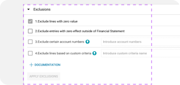
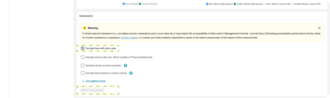
Exclusions
Quarter dates were removed from Exclusions as they better suit Design Tests Screen
(test parameters) than Refine Data Screen.
4 Exclusions are displayed instead of 2.
Account numbers and User IDs Inputs were added.
Documentation was added.

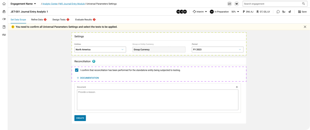
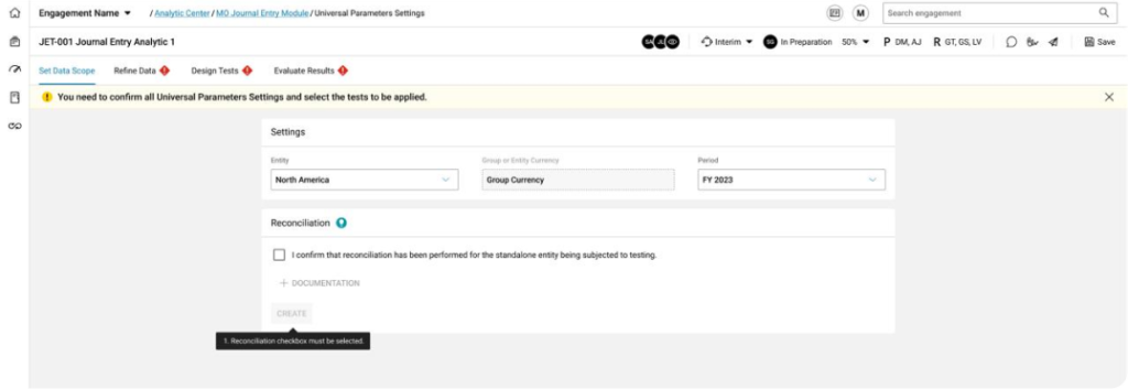
Universal Analytic Parameters Settings
The main parameters remain on the settings screen.
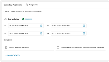
“Confirm Reconciliation” checkbox was added.
Documentation with open multi line text field was added.
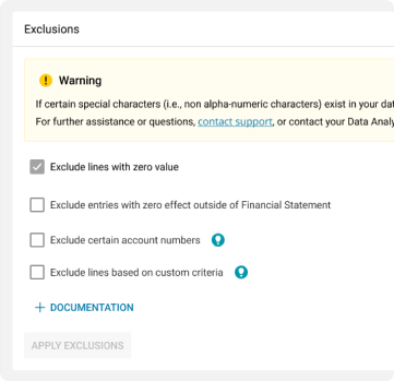
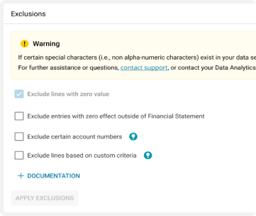
Exclusions
Quarter dates were removed from Exclusions as they better suit Design Tests Screen
(test parameters) than Refine Data Screen.
4 Exclusions are displayed instead of 2.
Documentation was added.
Exploration 3 was chosen as it better fits the requirements. It places functionalities effectively and offers flexibility with a minimalist “Confirm” checkbox and optional documentation.
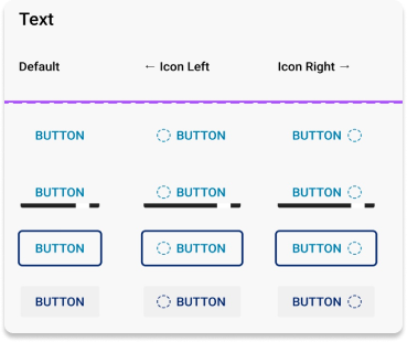
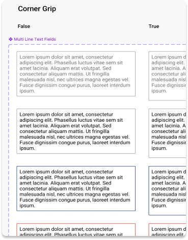
We developed local components for quick updates driven by business needs and user experience, based on Platform A’s design system, such as adjustments to test parameters in the analysis module.
We ended up with more than 20 screens with the same section. For example:

The local components have been effective, saving us significant time during updates – up to ten times faster.
All of our screens use the components in the design system


With our design finalized, which integrates both local and design system components, we discussed it with the team and additional stakeholders.
For the refinments 2 teams are add to the meeting. Developers and the CTO appears for the refinement sesion.
-Product Owners (2-3): Deliver the required tasks and set priorities.
-UX/UI Design Team (2-3): Open discussions with POs and BSAs to make the best approaches for the new designs.
-CTO and Developers (2-3): Consider design proposals’ integration with other modules and business needs.
-Design System Core Team (2-3): Consider design proposals’
integration with other modules and business needs.
-Meetings Frequency: 3 Times per week.

We begin the meeting once the main stakeholders have joined.
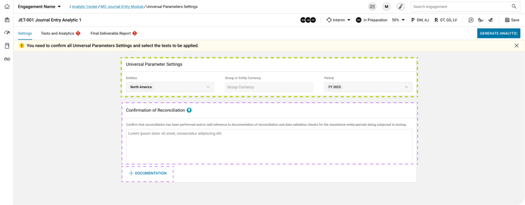
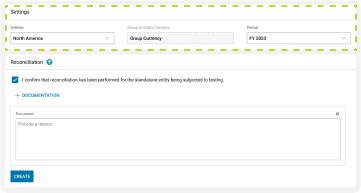
Universal Analytic Parameters Settings
The main parameters remain on the settings screen. Additionally, a new feature like confirm reconciliation was added.
Product Owner – Holly
“Our stakeholders say documentation is optional, so let’s keep it simple!”
Product Owner – Holly
“Our stakeholders say documentation is optional, so let’s keep it simple!”
Business Analyst – Sandra
“Holly confirmation must also be resolved manually.”
Business Analyst – Sandra
“Holly confirmation must also be resolved manually.”
Exclusions
UX Team – Martin
“If the first exclusion can’t be edited, we should use a different component to make this clear to the user.”
UX Team – Martin
“If the first exclusion can’t be edited, we should use a different component to make this clear to the user.”
Design S. Team – Chuck
“Agreed. We have another state with some transparency that might be a better fit in the design system.”
Design S. Team – Chuck
“Agreed. We have another state with some transparency that might be a better fit in the design system.”
Developers – Naruka
“Looks feasible; we have the core components. What are the rules for triggering the ‘Apply Exclusions’ button?”
Developers – Naruka
“Looks feasible; we have the core components. What are the rules for triggering the ‘Apply Exclusions’ button?”
Universal Analytic Parameters Settings
UX Team – Martin
“The changes have been made.”
UX Team – Martin
“The changes have been made.”
Product Owner – Holly
“Awesome; let’s continue with other screen.”
Product Owner – Holly
“Awesome; let’s continue with other screen.”
Business Analyst – Sandra
“Yeah, maybe we can continue with test evaluation.”
Business Analyst – Sandra
“Yeah, maybe we can continue with test evaluation.”
Exclusions
Design S. Team – Chuck
“Everything aligns with the design system core.”
Design S. Team – Chuck
“Everything aligns with the design system core.”
Developers – Naruka
Yes, it’s clear to me; I’ve seen the microinteractions documentation.
Developers – Naruka
Yes, it’s clear to me; I’ve seen the microinteractions documentation.

Names and photos of teammates were changed for confidentiality. We improved user experience and updated screens using Platform A’s design system across all Platform B modules
This case study showcases design documentation for micro-interactions, highlighting their role in enhancing user experience.

CONFIRM RECONCILIATION
Gesture: Click.
Trigger: Click on the reconciliation checkbox.
Feedback: Add Documentation and the ‘Create’ button transition from disabled to enabled states.
Mode:
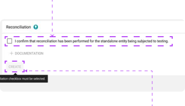
CREATE ANALYTIC
Gesture: Click.
Trigger: Click on ‘Create’ button.
Feedback: Display the ‘Refine Data’ screen.
Rules:
The same design process was applied where needed. For certain screens, I created prototypes for stakeholder presentations
After product owners and all teams agree that certain modules are ready for production, developers start working on them


User Testing and Feedback Collection Analysis helps identify pain points for auditors, but there is limited clarity on task efficiency. We have an opportunity to evaluate efficiency, task success rates, and learnability. The platform aims to enable auditors to complete tasks independently, without relying on teammates. Here is the plan:
Next let’s prioritize on helping auditors achieve success levels where issues are minimal, meaning they can resolve tasks effectively before reaching the time threshold.